Table editor
Make tables look like they were designed for your store. The visual table editor lets you adjust every detail with a live preview, without code.
Open the editor
In the app, click Appearance. You can customize two kinds of tables independently:
- Specification table — the specifications of a single product,
- Comparison table — used by comparison tables, variant comparison tables and the dynamic comparison dialog.
Click Customize on the one you want to edit. Add to your theme opens the theme editor with the matching block, ready to be placed.
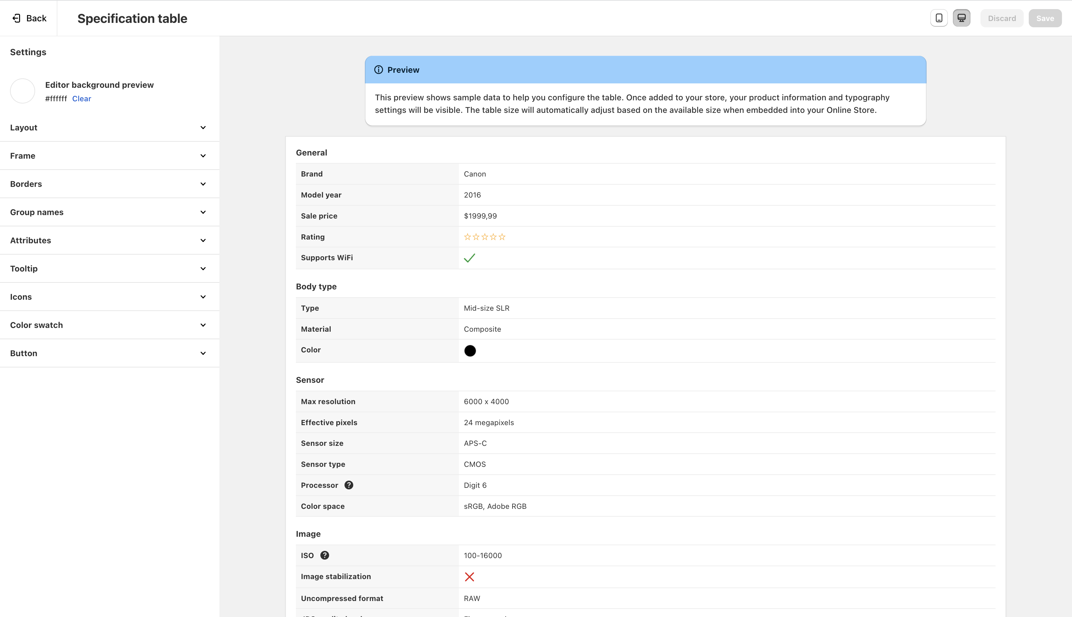
The settings are on the side, the preview in the middle. Use Preview mode to check how the table behaves at different widths, and Preview background to test it on a background that matches your theme. Click Save when you’re happy with the result.
About the preview
The preview uses sample data and a system font. On your store, tables display your product information with your theme’s fonts, and adapt to the available width. Always check the result on your store after saving.
Settings reference
Layout
Whether attribute names are displayed above their value instead of next to it: Narrow (only when the table is narrower than 400 px), Always or Never. Default: Always for specification tables, Narrow for comparison tables.
Hides attributes that don’t have a value.
Specification tables only: splits long tables into two columns on wide layouts, with a configurable Gap between columns.
Frame
Space around the table (reduced automatically on narrow tables), Border radius and Background color.
Borders
Show horizontal and/or vertical borders, and choose their color and style (solid, dashed or dotted).
Group names
Text alignment, space between groups, vertical and horizontal space, font size, font weight, background and text colors.
Attributes
- Vertical space and font size (also affects buttons).
- Attribute name: horizontal space and font weight.
- Attribute value: text alignment (ignored when attributes are stacked), horizontal space and font weight.
Row colors
Background and text colors of attribute names and values, or turn on Zebra-stripe table to alternate the background and text colors of odd and even rows.
Highlighted attributes (comparison tables): background and text colors of rows highlighted by the differences switch.
Values
- Rating: the color of the stars.
- True icon and False icon: the icon (checkmark, circled checkmark… / cross, circled cross…) and its color.
- Color swatches: Round color swatches (on by default) or square ones.
- Scale: for scale attributes, show the text value next to the bar (e.g. “3/5”), and the track and filled colors of the bar.
Tooltips
Font size, icon (question mark or info, regular or inverse), icon color, and the background, text and border colors of the tooltip content.
Buttons
Border radius, background, text and border colors, capitalization (normal, uppercase, lowercase) and font weight of buttons such as “View more” and “View details”. The compare bar of dynamic comparison uses the same border radius and font weight.
AI analysis Pro plan
Comparison tables only: font size, background, text and border colors of the AI buying advice box.
Tips for great-looking tables
- Leave colors on “Automatic” at first: the app detects your page background to pick sensible defaults, then adjust only what’s needed.
- Keep borders subtle. Horizontal borders alone are often enough.
- Use zebra stripes for long comparison tables, to help the eye follow a row.
- Add icons to attributes for a more visual, scannable table.
One appearance per kind of table
Appearance settings are global: all specification tables share the same look, and all comparison tables too. To style tables differently on some pages, see advanced customization.